MR HAS ALWAYS BEEN KEENLY AWARE OF HOW POWERFUL A WELL-CONCEIVED PIECE OF ART IN AN ARCHITECTURE OR INTERIOR DESIGN PROJECT CAN BE. SINCE OUR BEGINNINGS, ART HAS BEEN PART OF OUR DNA AND A BIG INSPIRATION FOR US, WHETHER WE ARE TASKED WITH SOURCING WORKS FOR A PROJECT OR DESIGNING A SPACE AROUND A CLIENT’S EXISTING COLLECTION. BUT IT IS THROUGH SITE-SPECIFIC COLLABORATIONS WITH ARTISTS, THAT WE ARE ABLE TO CREATE UNIQUE MOMENTS THAT ENHANCE THE SPATIAL EXPERIENCES OF A PROJECT.
IN 2014, WE WERE ASKED, AS PART OF THE DESIGN BRIEF FOR A FLAGSHIP AMERICAN BOUTIQUE FOR JEWELRY DESIGNER AURELIE BIDERMANN, TO INCORPORATE A SITE-SPECIFIC PIECE OF ART. WE EAGERLY EMBRACED THE OPPORTUNITY.
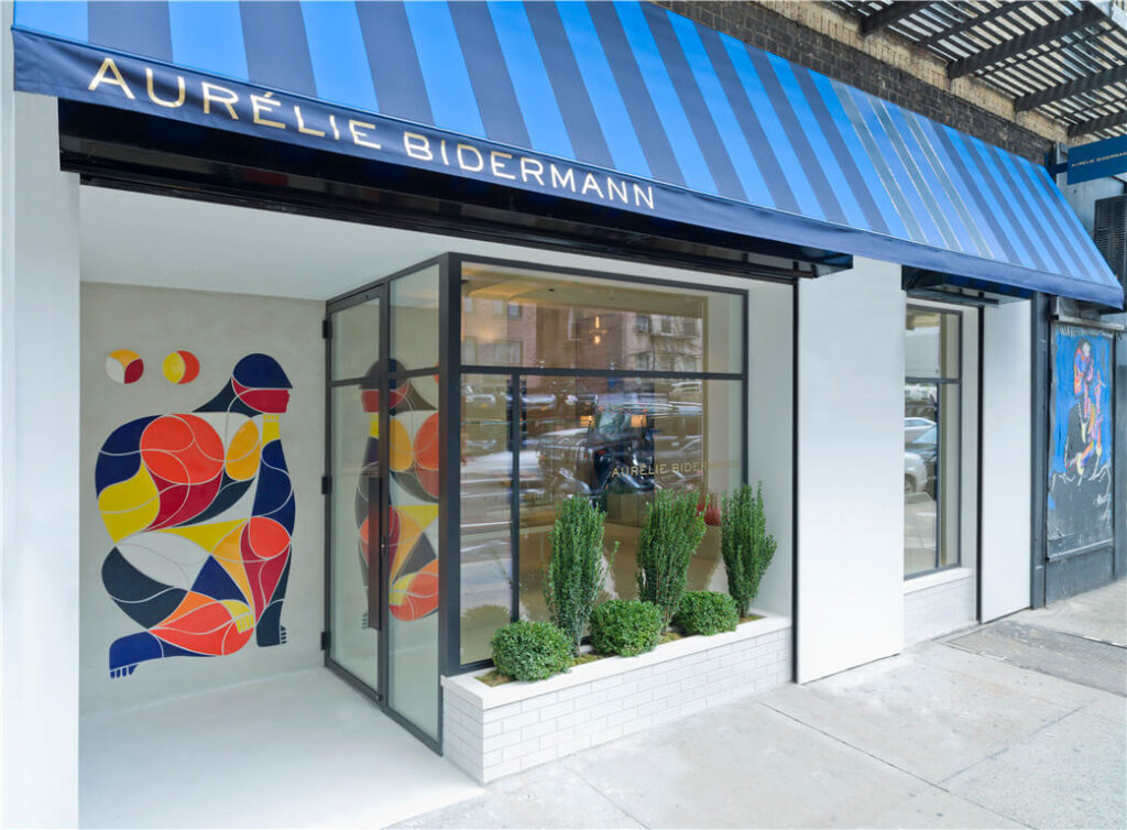
THE french brand HAD SELECTED A BUSY CORNER on lafayette street IN soho for the its first retail space in the us. THIS HISTORY-RICH NEIGHBORHOOD HAS BEEN AT THE HEART OF DOWNTOWN New York STREET CULTURE, ART AND FASHION SINCE THE late twentieth century. so the idea of incorporating such a piece became an opportunity to tap into the specific context of the site.
OUR DESIGN FOR THE SMALL boutique combined the brand’s simple luxury and refinement WITH the ENERGY AND AESTHETIC OF THE NEIGHBORHOOD to create a uniquely new york EXPERIENCE—a fresh new introduction to the French brand. our client included an image of a massive mural by world-renowned artist “remed” in their initial doSsier for the design, and it was discussed then that the commission would be a MURAL on the façade, ADJACENT to the entry door. this resonated with us, as it felt like a call-back to THE STREET ART SCENE OF DOWNTOWN NEW YORK from the 70’s and 80’s and its resurgence and prominence in the early 2000s as a powerful communal artistic expression and form of communication. THE IDEA FIT PERFECTLY WITH OUR GOALs.
GUILLAUME ALBY remed IS A 45-YEAR-OLD FRENCH BORN ARTIST WORKING ON LARGE AND SMALL-SCALE MEDIA. HE IS KNOWN FOR HIS oversized COLORFUL MURALS that appear IN MANY CITIES AROUND THE WORLD. HE HAS DEVELOPED AN IMMEDIATELY RECOGNIZABLE VISUAL LANGUAGE INSPIRED BY THE WORK OF 20TH CENTURY MASTERS LIKE MODIGLIANI AND LEGER AS MUCH AS THE MOROCCAN MOSAIC ART KNOWN AS ZELLIGE. HIS ART, whether viewed up close or from afar, AIMS TO ENGAGE THE VIEWER IN CONVERSATION. they are often LEFT WITH A STORY, A QUESTION OR AN IMPRESSION.
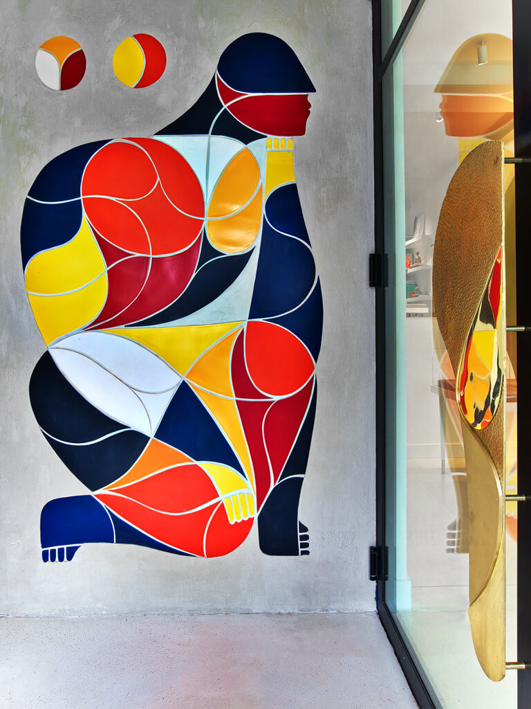
OUR CLIENt commissioned the artist to create a relatively small piece (compared to the expansive murals for Which he is famous), BUT ITS PLACEMENT WOULD have an immediate impact ON PATRONS and passers by, AS IT WAS LOCATED RIGHT AT THE store’s ENTRANCE. REMED DESIGNED A PIECE THAT BEAUTIFULLY MELDED THE SENSUAL and geometric LINES OF BIDERMANN’S JEWELRY ON DISPLAY, THE LUXURIOUS MINIMALISt ARCHITECTURE AND THE COLORFUL VIBRANCY OF THE NEIGHBORHOOD.
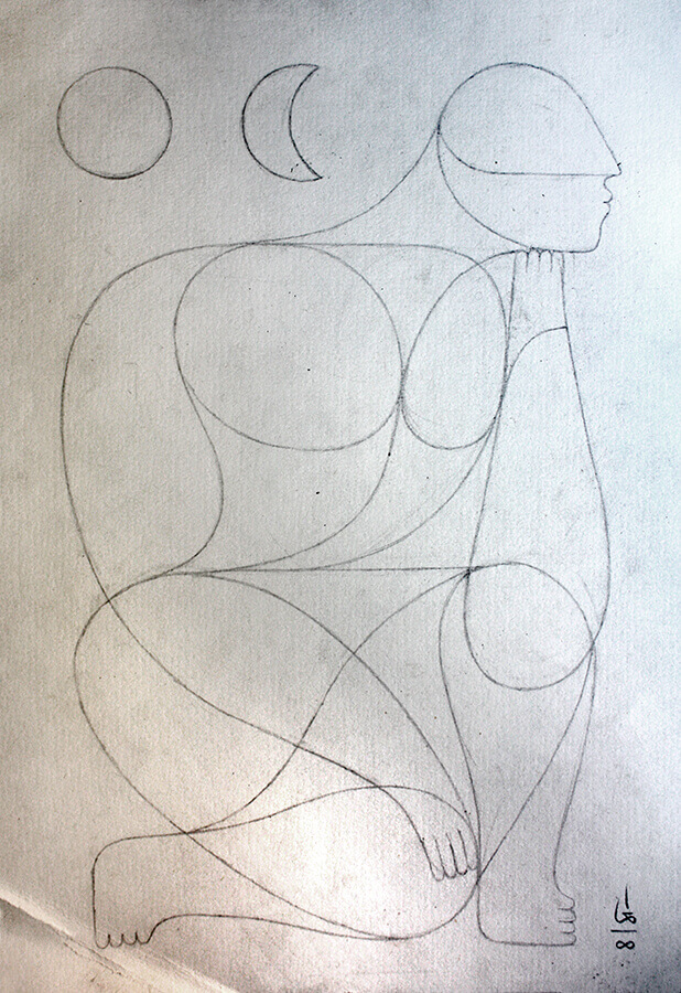
CALLED ‘JE PENSe, car je sens, donc je suis’ or ‘je pense’ for SHORT (which translates to I think), IT’S AN ARRANGEMENT OF MULTICOLORED SHAPES THAT FORM AN ABSTRACT FIGURE, kneeling in thought. AS ALL OF REMED’S WORK, THE completed image invites us to discover the smaller forms within which have a beauty of their own.
remed has discussed his inspiration for the piece in detail, but it could be SUMMARIZED as a very personal statement of his desire to find serenity at a time when his own life was extremely busy with engagements. the figure is thinking, as if contemplating options and making decisions on how to move forward.
HAVING WORKED IN MANY DIFFERENT MEDIUMS: including PAINT, METAL, and FABRIC, remed’s DECISION TO make a CERAMIC TILE mural FELT NATURAL TO HIM. this medium also TRANSCENDED paint, which has always been THE PREVALENT language OF STREET ARTISTS. once he SETTLED ON LARGE SCALE CERAMIC TILES, the SEARCH began for an artisan that could PRODUCE the pieces to his SPECIFICATIONS while also aligning with his vision. he found a porcelain tile studio named modcraft, owned and operated by David clark and located in beacon, neW york. the studio’s close proximity to the city allowed remed to lock in production times and enabled MR to coordinate the mural’s installation with the completion of the store.
REMED spent a week WORKING AT modcraft, understanding their process and the POTENTIAL and LIMITATIONS of the medium. this in turn, influenced the final design of the piece, WHICH was CONCEIVED TO BE VIEWED FRONTALLY AS ITS LOCATION AT THE ENTRANCE OF THE SPACE DEMANDED.
TECHNICALLY, it was a challenge to create these large tiles which needed to fit as pieces of a puzzle, much like mosaic. many tests were conducted to understand the BEHAVIOR of the material. a lot of practice went into learning how to cut the clay by freehand which remed, in an example of the care and sensitivity he brings to his work, described as being a discovery process: ‘learning to move the blade without hurting it, as it has memory.’ it was important to then ascertain how much the material would transform when fired and the tolerances that NEEDED to be considered in order to successfully assemble the pieceS. the next ELEMENT TO think about WAS COLOR. the artist had envisioned A SPECIFIC PALETTE for the piece AND WORKED WITH the studio TO create THE CORRECT HUE AND FINISH. these colors are very much part of remed’s own language and can be seen ACROSS MANY OF HIS WORKs. yet, THIS PARTICULAR PALETTE worked well with the store brand and our INTERIORS, standing out AGAINST THE MOSTLY WHITE ARCHITECTURE and complementing the PRODUCTS and furnishings which were inspired by summers at the cote d’azur and amalfi coast.