When one visits MR’s office, they exit the elevator on the building’s 10th floor and are greeted by a black wall with the firm’s logo letters in an oversized, high-sheen, vinyl decal. Inside, there are more black walls—along with some that are white—blackened steel shelves that line the main walkway, workstations with black desks and file cabinets and a conference room that is enclosed in black-tinted glass. When David Mann, MR’s principal, emerges, he is dressed in black from head to toe. And even before the first meeting at the office, a visit to the firm’s website reveals that same non-color theme of black and white. These first impressions may lead some to assume that MR’s aesthetic is one that lacks color. As in any discipline of design, in architecture and decor, there is an indisputable simplicity in the use of black and white that makes the combination most appropriate for certain work, for example, the Dior Homme store or this United Nations Plaza Residence. Regardless of this truth, we do love color, and we love the opportunity to work with it in our projects. For our June post, a few of us MR share how we see and think about color, how color makes us feel, and what to consider when using color in our work. Image: Wikimedia Commons/Ulises00
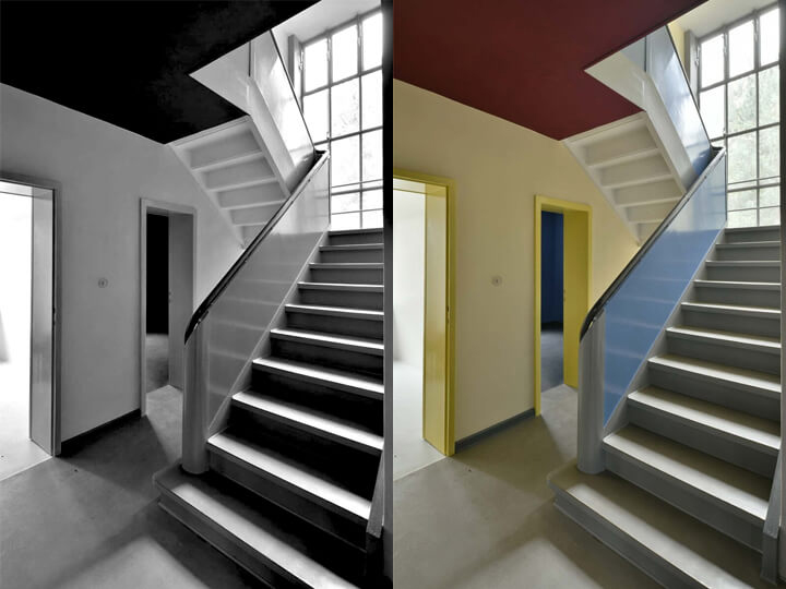
Although many early photographs of modernist design were in black and white, leading to the misconception that modernism lacked color, the truth is that color was integral to modern design. Movements like the Bauhaus embraced vibrant colors as a core part of their aesthetic, integrating them into architecture, furniture, and everyday objects. Designers like Frank Lloyd Wright used rich natural tones that brought warmth and vibrancy to their spaces. Unfortunately, the absence of color in photographic documentation contributed to the false notion that modern design was cold and sterile, when in fact it often celebrated color in thoughtful and innovative ways. Foto: Thomas Wolf © Wüstenrot Stiftung
-David
There are so many nuances regarding color: its pairing, the effect of its finish or texture… But one of the most important things about color in architecture and interiors is seeing your choices in the actual exposures of the space, at different times of day and with lighting. Never underestimate how different colors can look from putting together a palette at the office, to seeing them onsite at a project. It may sound over-the-top to sample 20-something colors for a room, but it is really more like due diligence. Image: Joshua McHugh
-William
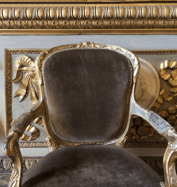
I would like to confess here a fascination with colors that fall mysteriously in-between or are a puzzling mixture of several colors. This handsome velvet upholstery is currently living on an armchair which sits very happily in a grand public room within the Medici palace in Florence Italy. I personally find it to be a fantastic mixture of hues which becomes a great neutral color. To me, this calm and seductive color is a perfect complimentary color, which lives very well with most Autumnal and other warm colors. What does one call this color? Sunburnt Rat, Faded Root Beer, or Elephant’s Breathe perhaps. The describing and naming of colors, I believe to be an art unto itself and a worthy subject of its own entire blog.
-Fritz
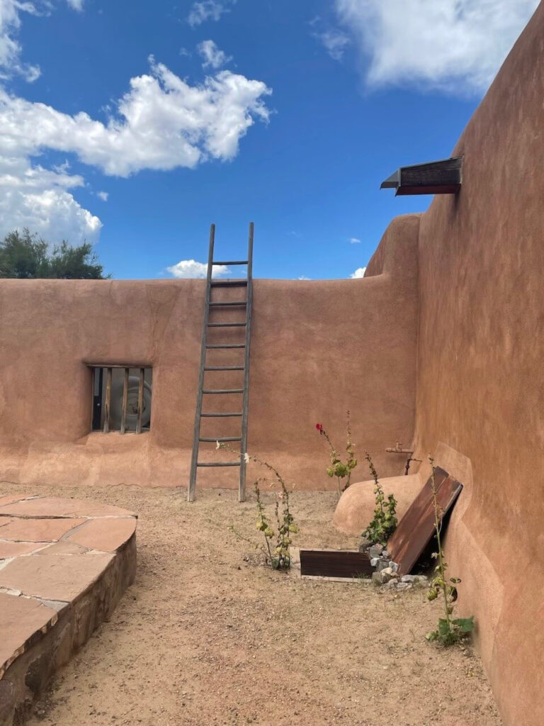
When I visited Georgia O’Keeffe’s home and studio in Abiquiú, I was struck by the soft rose-pink stucco that covered its thick adobe walls. Blending traditional Pueblo architecture with quiet modernism, the building’s color seemed to shift with the light—from pale terracotta to dusty blush. The structure felt completely enveloped by its environment, sharing the same warm, muted tones as the desert around it. In that moment, I could feel the inspiration that shaped her paintings and understand why she felt so content and at home in the warmth of her New Mexico surroundings.
-Allison
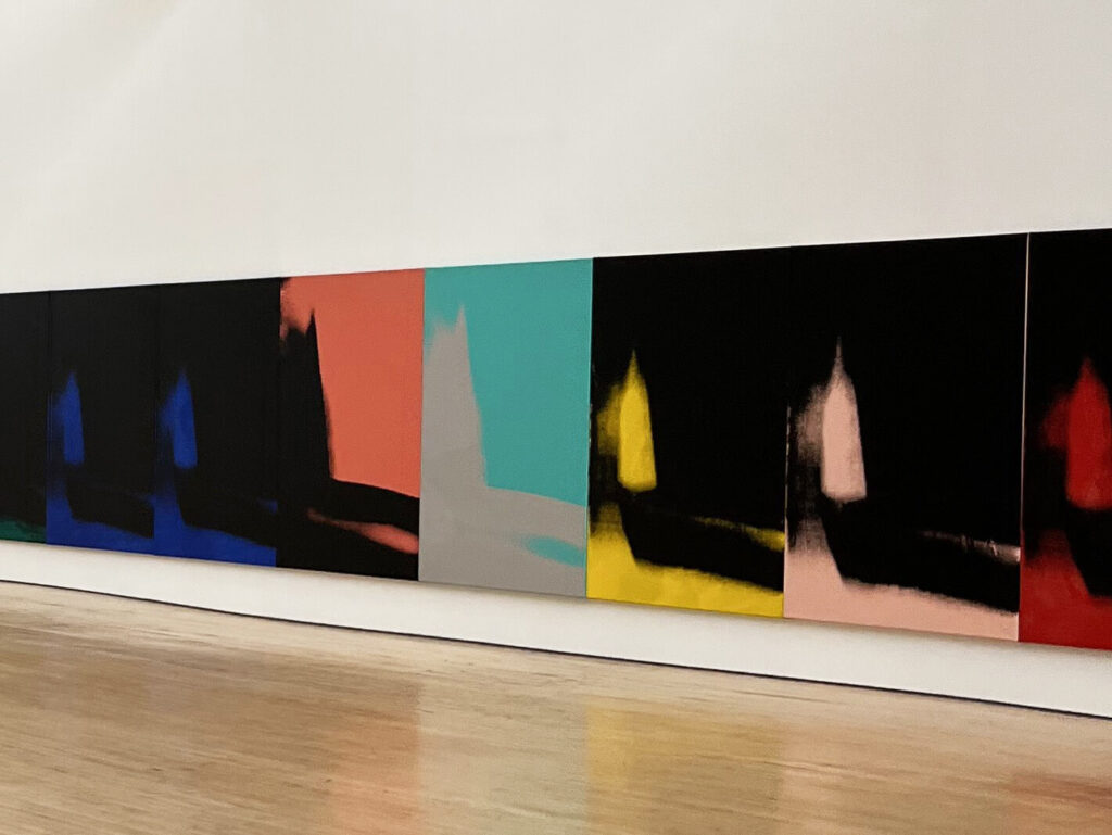
I visited Dia Beacon last Fall and was moved by Andy Warhol’s “Shadows” exhibition. The series of silk screens dominate the minimalist, light-filled space rendered in a spectrum of luminous hues. The palette moves in a sequence between velvety blacks and vibrant colors. What struck me most is how Warhol turns repetition into revelation—each canvas similar in form but entirely distinct in tone. The color is never just decorative; it becomes an atmosphere, an emotion. It was fun to walk around the space and discuss the how each piece revealed a new mood as colors unfolded.
-Becca
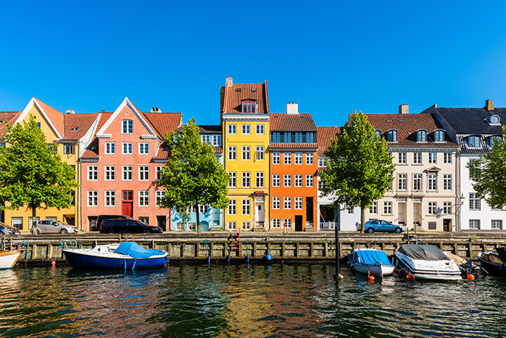
While I’m often inspired by color’s visual impact, I find its emotional and psychological influence to be even more powerful. We’ve all felt how a warm-toned space can feel inviting, while a cool-grey environment, for example, might create calm or even detachment. Color alone can subtly shift our mood and attention. While walking through Copenhagen on a recent trip, I noticed how present and engaged I felt. I paid attention to people, buildings, sounds—things I often tune out in New York. Here, the repetitive, grey urban landscape seems to dull the senses. Marc Augé’s idea of “supermodernity” and “non-places” comes to mind—spaces that feel disconnected and interchangeable. But in Copenhagen, color breaks that monotony. Streets like Nyhavn, with their vibrant facades, set the tone. Even new developments carry this spirit, shifting hues on every block—deep reds, historic oranges, soft greens, muted blues. These subtle changes catch the eye and reawaken awareness. To me, the juxtaposition of the experience of simply walking down the street shows color’s real strength—not just in making spaces beautiful, but in helping us feel grounded, connected, and fully present. Image: istock/Allard1
-Ashira
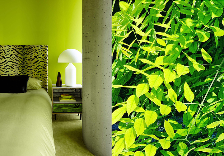
Color is without a doubt a source of both inspiration and joy for me. It’s something I notice and am in awe of in my daily life, especially when it comes to colors in nature. I am genuinely amazed when a manufactured color in a built environment catches my attention and I can trace it back to something that exists naturally. I’m thinking of a neon green paint that looks at first, artificial, but is actually the exact color of a new spring leaf or a highly-saturated yellow textile that is the exact color as both an egg yolk and the petals of a marigold. My dream space is pretty plain—white walls with natural wood for flooring, doors and trim. But layered in, there is color—in the furniture and accessories, in artwork or even in plants and flowers. Image (L): Joshua McHugh
-Andrea
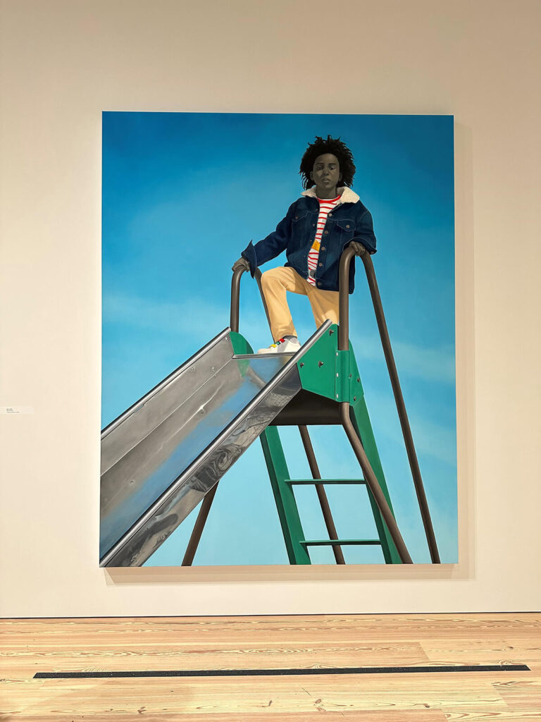
I recently went to see the Amy Sherald exhibit at the Whitney Museum. I was only familiar with her portrait works previously and was really overtaken by the photorealism and use of color in many of her pieces. Where one might let the heaviness of Breonna Taylor’s portrait wash over them, the abundance of cheery colors and scenes of every day American life buoy the overall tone of the show. One of my favorite pieces in the show is called Kingdom. In this work, Sherald continues her exploration of Black identity, depicting her subject against a flat, vibrant background that contrasts sharply with the grayscale skin tones she is known for. This intentional desaturation removes racial markers, inviting viewers to engage with the subject beyond surface-level assumptions. Meanwhile, the bold, almost surreal colors of the clothing and backdrop evoke a sense of regality and presence, reinforcing the painting’s title. Sherald’s careful balance between muted and vivid tones not only draws attention to the individuality of her subject but also imbues the piece with a quiet strength and timeless elegance.
-Kim
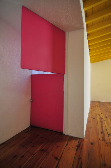
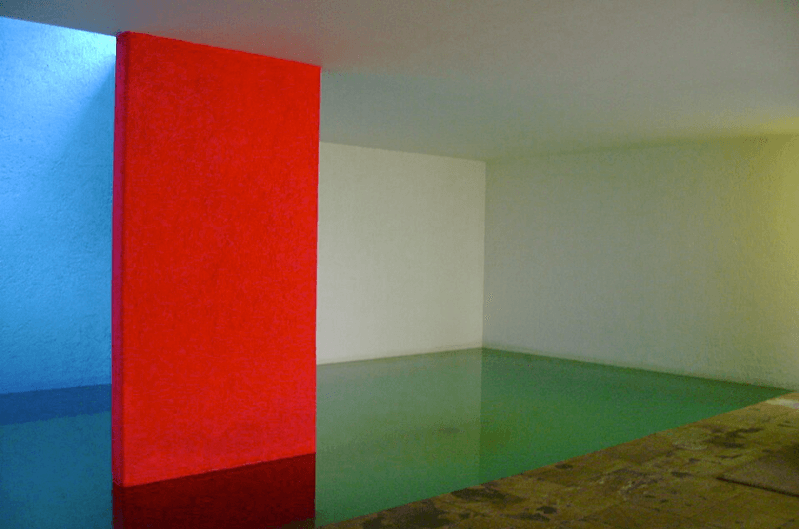
My approach to working with color can be summarized by a teaching from a mentor of mine at my first job in New York, fresh out of grad school: One can apply color to single surfaces or planes to create impactful moments in an interior or to a building’s exterior. Color can also be applied to contiguous surfaces to create volumes. At MR, we have used both these methods with great success. The key to creating volumes with color is to understand the architecture, identify where the surfaces connect and where the natural start and end points are. It is also important to understand the purpose of the application of color and how space is transformed by it. There are other ways to use color, but these two approaches have stayed with me as a formative principle when creating here at MR. Image: 準建築人手札網站 Forgemind ArchiMedia
-Robin